From Sage to Emerald: The Complete Guide to Green Front Door Colors
Disclosure : This post may contain affiliate links or paid partnerships. I may earn compensation if you click a link or make a purchase, at no additional cost to you. See my disclosure for more info.
You notice the front door every single time.
Not in a good way.
It’s the color, or the lack of it. Something about it reads as forgotten rather than chosen. And for a feature that carries as much visual weight as a front door, “forgotten” is a problem.
You’ve looked for answers. Gathered inspiration. Studied the homes that seem to have it figured out. But translating someone else’s beautiful door into the right color for your particular house is harder than it looks.
The front door frames the entire exterior experience. Before anyone notices the landscaping, the porch light, or the trim details, they see the door. It sets the tone for everything else. When it’s right, the whole exterior reads as intentional. When it’s wrong, everything else compensates for it.
Your instinct is green. Something alive. Something that earns attention without demanding it. Something that makes your home feel like a decision was made about it — a good one, deliberately.
The challenge is that green is vast. The wrong shade — too bright, too murky, the wrong temperature for your exterior — can leave you worse off than you started.
Here is the complete breakdown. Every significant green front door color, explained in context, with the specific logic that makes each one work or fail on particular homes.
What Makes Green Uniquely Suited to Front Door Applications
Green’s success as a front door color has real foundations — in visual science, exterior design practice, and human psychology.
Physiologically, green sits at the center of the visible light spectrum. The eye focuses on it with minimal muscular effort. That’s why green environments — forests, parks, gardens — feel restful in a way other environments don’t. The same principle applies to a green front door: it attracts the eye without strain.
From an exterior design perspective, green’s main advantage is range. It’s one of the only strong accent colors that pairs successfully with nearly every exterior material type. Warm masonry, cool stone, painted wood, white clapboard — green finds a way to complement rather than compete.
Blue can feel cold against the wrong stone. Red can argue with warm brick. Yellow can overwhelm pale exteriors. Green navigates these conflicts with a flexibility that other accent colors rarely manage.
And psychologically, green carries a specific message: welcome, growth, vitality. A green front door doesn’t just look good — it communicates something warm before the door is ever opened.
Now for the specific shades that deliver on these promises.
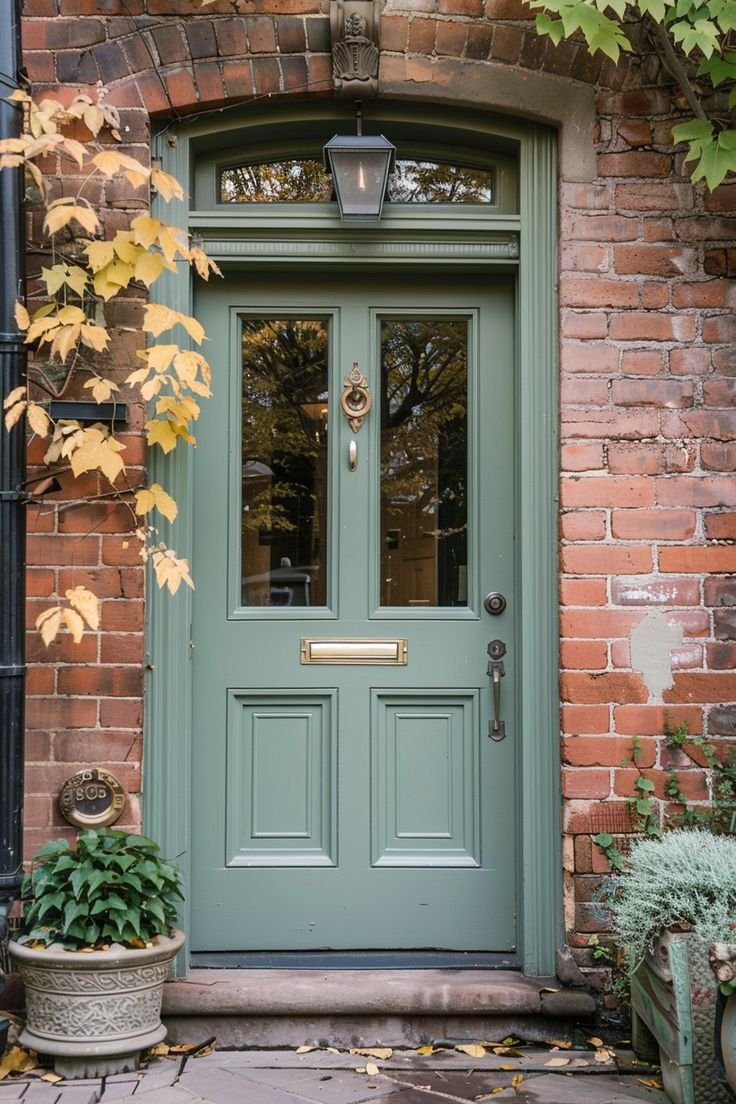
1. Sage Green — When Subtlety Is the Strategy
Sage green is the choice for homeowners who understand that the most sophisticated things are often the quietest ones.
Its gray-green base keeps it from reading as purely herbaceous or countrified. Instead, it occupies a more elevated register — nuanced, layered, and genuinely complex in the way that earns a second look rather than an immediate one.
Sage pairs particularly well with warm whites, cream-based trim colors, natural wood tones, and masonry with amber or sandy undertones. It reads especially beautifully on homes that have aged into something better than new — farmhouses, cottages, properties with genuine material history.
If your brick or stone contains warm tones — gold, peach, terracotta — sage green will draw those qualities forward without competing with them. The relationship is complementary rather than contrasting.
A practical note: Strong sunlight bleaches sage. If your door faces south or receives significant afternoon light, test a shade or two deeper than the one that initially appeals. Paint consistently dries lighter than swatches suggest.
2. Hunter Green — Architecture’s Favorite for a Reason
Hunter green has survived every design era because it operates at a level that trends can’t reach.
It has furnished the entrances of Georgian townhouses, Victorian Painted Ladies, Craftsman bungalows, and contemporary builds alike. It works across all of them because it doesn’t belong to any of them. It simply belongs to the category of “right.”
Hunter green reads as a dark warm neutral. It has authority and depth but carries a warmth that prevents it from feeling cold or funerary the way black can. It’s rich without being directional — it doesn’t read as obviously warm or obviously cool.
The classic pairing of hunter green with polished brass hardware is one of those exterior combinations that consistently looks more expensive and considered than it is. Add Brass door knocker, Brass kick plate, and Brass house numbers for full cohesion.
Important consideration: Hunter green’s warm undertones create visual friction against blue-gray or very cool silver-toned exteriors. If your home’s exterior palette is predominantly cool, look to the later shades in this guide.
3. Olive Green — The Color That Earns Admiration, Not Applause
Olive green doesn’t perform. It simply exists — settled, grounded, and entirely sure of itself.
Sitting between green and brown, olive carries a naturalistic quality that reads as organic rather than designed. It’s the kind of color that doesn’t register immediately but stays with you. The sort of thing you notice and then find yourself thinking about.
On properties where the surrounding landscape forms part of the architectural identity — tree-lined lots, native plant gardens, gravel paths, stone retaining walls — olive green is outstandingly effective. The door feels continuous with the setting. Not placed in front of it.
Dark exterior palettes are natural partners for olive. It bridges the gap between very dark siding and the landscape without creating the contrast that would make the entry feel like an afterthought.
One thing to test: Olive can go flat in shadow or under a deep overhang. Your showroom sample is not your door. Test in the actual conditions your entry operates in before committing.
4. Emerald Green — The Jewel Tone That Changes Everything
Emerald green is not a background player. It is, unambiguously, the protagonist of any exterior it appears on.
It’s a jewel tone in the fullest sense — saturated, dimensional, and instantly luxurious. The kind of color that makes people slow down when driving past. That changes the entire read of a street. That turns an ordinary entry into an event.
White trim is the essential supporting element. Bright, crisp white against the depth of emerald green generates the contrast that produces the jaw-drop moment. Without it, even a beautiful emerald can feel heavy.
Hardware sets the personality. Matte black handles and hinges bring emerald into a contemporary register. antique brass returns it to something more classical and historically resonant.
Where emerald performs best: On doors with genuine architectural depth — panels, molding, sidelights, transoms. Architecture gives emerald something to illuminate. On a flat, featureless door, the color can feel heavy rather than jewel-like.
If your door is plain, consider a paneled door before applying paint. The combination of a well-crafted paneled door and emerald green is one of the most dramatic, cost-effective exterior transformations available.
5. Forest Green — Permanence Made Visible
Forest green is rarer on residential exteriors than it deserves to be, which means the homes that use it correctly stand apart.
Darker than hunter, quieter than emerald, forest green projects a specific quality that neither of those shades quite captures: permanence. It looks like a color chosen with intention and held with conviction — not because of fashion, but because it simply fits.
The homes that benefit most are traditional in structure: Colonial proportions, Federal symmetry, classic American farmhouse bones. Against white or ivory trim and black shutters, forest green produces curb appeal that’s measured in decades rather than seasons.
And there’s a practical dimension here too. Buyer perception research consistently shows that deep, rich greens communicate maintenance and quality at a subconscious level. A forest green front door doesn’t just improve how your home looks. It improves how your home is understood by everyone who sees it.
That’s a relatively rare thing for a paint color to accomplish. Forest green earns that outcome.
6. Mint Green — Optimism You Can Paint On
Mint green is for homeowners who want their door to make people smile before they even ring the bell.
It’s light, fresh, and carries an easy optimism that’s immediately appealing. In the right context, it’s one of the most charming front door options available. In the wrong context, it can register as unintentional.
Context is everything with mint. Beach properties love it. Tropical-style bungalows belong with it. Mid-century modern homes with clean horizontal lines and minimal ornamentation are natural partners. Neighborhoods where personal expression is part of the character are ideal.
For mint to read as elegant: the surrounding exterior needs to recede. White or near-white exterior only. No competing accent colors. No busy trim. The entire composition should support the door as its single focal point.
Pull that off and mint is unforgettable. There are neighborhoods where one house is described and remembered simply by the color of the front door. That’s a form of curb appeal no other feature can replicate.
7. Eucalyptus Green — The Designer’s Solution for Cool-Toned Exteriors
Eucalyptus green has become one of the most discussed exterior accent colors among residential designers because it solves a problem that previously had no clean answer.
For cool-toned homes — blue-gray lap siding, pale stone cladding, crisp white stucco — finding a green that harmonizes rather than conflicts has historically been difficult. Warm greens fight the cool exterior. Neutral greens disappear against it.
Eucalyptus bridges the gap. It’s soft enough to feel composed, cool enough to harmonize with blue-adjacent exteriors, and distinctly green enough to provide genuine color. On the right house, it reads as though the exterior was conceived around the door color rather than assembled from separate decisions.
For accessories: matte black hardware, concrete planters, and modern house numbers in a contemporary typeface. Together, these elements land precisely in the modern-organic register that defines the most resolved residential exteriors of the current design moment.
The final flourish: Flank the door with potted greenery — real plants when possible — and the entry transitions from accent color to integrated element. The door doesn’t sit in front of the landscape. It participates in it. That difference — between an accent and an integration — is what distinguishes a front door that’s been painted from an exterior that’s been designed.
How to Get the Result Right: Five Rules Worth Following
The shade is identified. Before the paint goes on, here’s how to ensure the result is one you’ll be satisfied with long after the initial excitement has settled.
1. Test with physical samples, not screen images. Monitors, phones, and tablets render color inconsistently based on their display technology and brightness settings. Order a peel-and-stick sample or paint a test section. Observe it across at least three days and in different light conditions before purchasing a full can.
2. Audit your fixed elements before committing. Roof materials, masonry, hardscape — these are the constraints your green must work within. Know what you can’t change, and select the shade that works best within those constraints.
3. Make a deliberate sheen selection. High gloss amplifies depth and reflects surface imperfections. Satin is more forgiving and reads as appropriately polished for most residential front doors. Matte finishes can look intentional on certain contemporary homes but show wear more quickly. Select based on the look you want, not the default on the paint display.
4. Paint the door edge. It’s visible whenever the door opens. Matching it to the face of the door is quick and takes the result from “painted” to “finished.” Every professional painter does it. Every homeowner who notices it is glad they did.
5. Consider the color across all seasons. Deep hunter green beside a fall wreath in October is stunning. Does it also work next to your summer planters in July? The best front door colors maintain their appeal year-round. If the color only looks its best in one season, you’ll feel its absence in the others.
The Only Thing Left Is the Decision
You started here with a front door that wasn’t working. You’re leaving with a clear path forward.
The shades are in front of you. The reasoning is clear. The testing process is outlined. Everything needed to make a confident, lasting choice is here.
What remains is committing to it.
The familiar path: More browsing, more comparing, more months of an exterior that makes you wince slightly every time you pull into the drive.
The better path: Order the sample for the shade that made you pause. Get it on the door. Step back to the street and let yourself see the exterior as it should be.
A great front door color does something that’s rare in home improvement: it changes how you feel about coming home. Every single day.
Fresh. Elegant. Right.
That’s what happens when the green is correct.
You know which one. Go find it.