Transform Your Futon Into a Living Room Focal Point (No Interior Designer Required)
Disclosure : This post may contain affiliate links or paid partnerships. I may earn compensation if you click a link or make a purchase, at no additional cost to you. See my disclosure for more info.
Your futon has potential. Genuine potential.
The problem isn’t the piece itself. It’s that nobody explains clearly how to unlock that potential — how to take a futon that looks like a holdover from a college apartment and turn it into a seating focal point that makes visitors actually comment on how good the room looks.
Interior architects have a system for this. It works on any furniture, including futons. And it’s learnable.
What follows is a complete, practical breakdown of that system — the exact decisions, in the right order, that produce a living room that looks thoughtfully designed rather than casually assembled.
You don’t need to replace anything. You need to rethink how the pieces you have are positioned, combined, and lit.
Let’s walk through it.
1) The First Fix: Give the Futon Some Breathing Room
The most common futon styling mistake has nothing to do with pillows or blankets.
It’s placement. Specifically: the instinct to press the futon against the wall and leave it there, flat and wide, like it’s been parked.
Furniture in a well-designed room doesn’t park. It occupies space actively, defining the areas around it.
Move the futon a few inches forward from the wall. That small gap introduces a shadow line that adds visual depth to the piece and signals that it was placed with deliberate consideration. The futon stops looking temporary and starts looking positioned.
If the futon frame is visible, this matters even more. A frame with space around it becomes a design detail. A frame pressed into a wall disappears entirely.
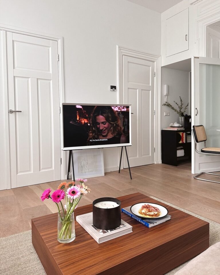
2) Lay the Foundation: Get the Rug Right
The rug is the most powerful single element in a living room layout, and it’s almost always too small.
An undersized rug makes furniture look like it’s barely tolerating its situation. The right-sized rug makes furniture look purposeful and anchored.
The benchmark: at minimum, the front two legs of the futon sit on the rug. Ideally the rug extends well beyond the futon on both sides and out in front of it, creating a visual container that says “this is the seating area.”
A jute rug brings warmth without competing visually with the futon. A flat-weave rug adds tactile interest while keeping the overall look clean.
The rug is the foundation. Get this right before anything else.
3) Rethink the Throw: One Side, Off-Center
Draping a throw blanket straight across the full width of the futon is the most natural thing in the world and also one of the least effective styling choices.
It reads as “covered,” not “styled.” It makes the futon look like a bed, which is the opposite of the goal when it’s in sofa configuration.
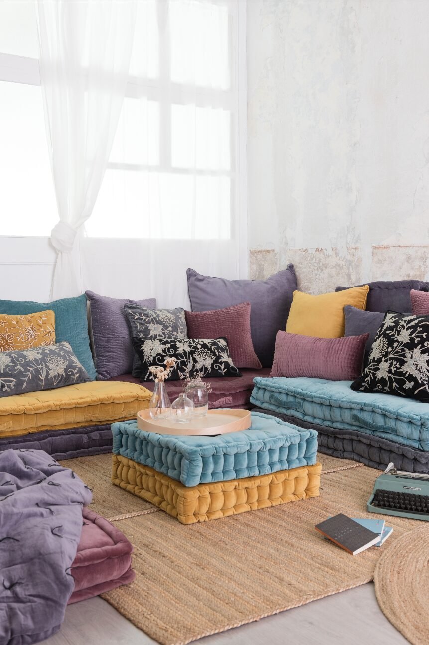
Here’s the approach that actually works: fold the throw into a long, narrow rectangle — approximately one-third of the futon’s width. Drape it over one armrest. Let it hang. Asymmetrical. Off to one side.
Asymmetry communicates ease, confidence, and taste. Symmetry communicates “I arranged this for a photo.”
And choose textural contrast. A chunky knit draped over a flat-woven futon. A linen throw on a velvety surface. Contrast between materials creates depth that reads immediately as “designed.”
4) Build an Intentional Pillow Arrangement
The sweet spot for pillow count is three to five. That range is wide enough to be flexible but narrow enough to provide structure.
Odd numbers look more natural than even numbers in most design contexts. Odd quantities avoid the formal, paired symmetry of showroom displays.
Work in layers: large pillows at the back, touching or near each armrest. Medium ones overlapping slightly in front. One smaller accent pillow, positioned just off-center.
Vary the materials: a velvet pillow beside a woven textile. A flat-colored pillow beside a simple print.
Add one shape variation: a lumbar pillow among the square cushions. That single rectangle breaks the row and elevates the entire arrangement from “bought as a set” to “assembled with intention.”
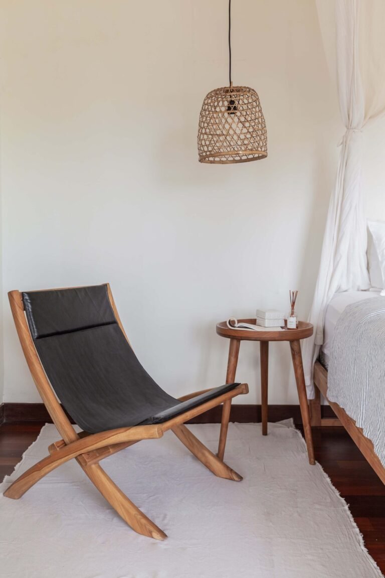
5) Complete the Seating Area With a Side Table
This is the most underestimated step.
A futon without a side table nearby feels incomplete. Not “minimalist” — incomplete. The seating area needs an endpoint, something that marks its edge and provides function alongside the form.
A round side table alongside a rectangular futon uses the classic design contrast of curved and straight. A wooden stool is the budget-friendly version of the same idea.
One detail that matters disproportionately: match the table height to the armrest. Even with the arm, not taller or shorter. This makes the table feel like it belongs to the futon, not like it was placed nearby by coincidence.
Top the table with three items only: a small lamp, a candle, and one book or decorative object. This “vignette” — a composed micro-scene — adds life to the area without adding clutter.
6) Layer the Lighting
The right lighting can make an average room look stunning. The wrong lighting can make a beautifully styled room look flat. It’s one of the highest-leverage variables in interior design.
Overhead fixtures — the default in most homes — produce even, shadowless light that eliminates the sense of depth and warmth that makes a room feel designed.
Add a floor lamp to the futon area. Use a warm-toned bulb — around 2700K, which produces the amber glow associated with inviting, sophisticated spaces.
Then add a second source on the other side of the room. A table lamp, soft ambient lighting, anything warm. The goal is multiple layers of light at different heights and from different directions.
The depth and warmth that result will make your futon look like it belongs in a professionally designed room. Because it does.
7) Finish the Composition: Address the Wall Behind
Think of the futon as a piece of art and the wall behind it as the frame. Without the frame, even the best painting feels incomplete.
A bare wall behind a seating piece is an unfinished composition. Fix it with one of three approaches:
A single large piece of art hung centered above the futon, with the visual center at standing eye level. Not higher — the persistent habit of hanging art too high is worth actively resisting.
A gallery grouping of three to five pieces, contained within the width of the futon below them. Never wider than the furniture — that proportion rule is non-negotiable.
A large round mirror that amplifies light, enlarges the perceived space, and gives the wall strong visual presence with no pattern or color competition.
Pick one. Commit. Don’t combine approaches.
8) Verify the Room Can Be Moved Through Easily
No styling decision compensates for a room that’s difficult to navigate.
If moving from one side of the room to the other requires squeezing past the futon, the room will always feel cramped regardless of how attractive it is.
Ensure at least 18 inches of clear space along the primary path through the room. If space is tight, angle the futon slightly off the wall. Even a gentle angle changes how spacious the room feels and how naturally people move through it.
Function and flow first. Visual refinement after.
9) Add Height With a Plant
A living room full of low, horizontal furniture needs a vertical counterpoint to feel balanced.
A tall plant — fiddle leaf fig, dracaena, snake plant, monstera — placed beside the futon draws the eye upward and introduces a vertical line that makes the whole room feel more dynamic and alive.
Position it on the emptier side of the futon, or in the corner nearest the end of the piece.
One tall plant is enough. The goal is contrast, not decoration density.
If natural light is limited, a lifelike faux plant delivers the same vertical impact and organic warmth. Nobody needs to know.
10) Simplify the Color Story
Most styling problems that seem complicated — “something is off but I can’t figure out what” — are actually color problems.
Too many colors competing for attention create an unsettled feeling that’s easy to sense but hard to name.
The solution: commit to three colors, each with a defined role.
Dominant — the futon and rug, your largest surfaces. Supporting — the throw and pillows, present but secondary. Accent — one pop of something different, appearing once in the room.
Three colors. Three roles. No additions.
When color is this disciplined, inexpensive pieces look expensive. When it isn’t, even premium furniture looks disorganized.
11) Calibrate the Coffee Table Relationship
The space between the futon and the coffee table in front of it may seem like a minor detail. It isn’t.
The correct distance is fourteen to eighteen inches — measured from the front edge of the seat cushion to the nearest edge of the table. This range allows comfortable use without making the seating group feel disconnected.
Size the coffee table to roughly two-thirds of the futon’s length. This is the proportion designers return to repeatedly because it reliably looks balanced.
In tighter spaces, two small nesting tables offer maximum flexibility. A round ottoman with a tray brings the added benefit of doubling as extra seating when needed.
12) Think Through the Bed Configuration
The futon has two modes. Style it for both.
Before locking in your room layout, verify that the futon can fully extend without obstruction. Identify which items need to move and make sure they can be moved quickly and easily.
A dedicated basket or bin — attractive, placed near the seating area — is the detail that makes the transition smooth. When the futon folds out, pillows and the throw go into the basket. The room stays organized. The whole conversion takes under a minute.
A futon that works gracefully as both sofa and bed is a complete design solution. One that only works as a sofa is only half the story.
The Room You Want Is Already Within Reach
Nothing about your current situation requires a major overhaul or a significant financial commitment.
The gap between where things are now and the room you want is a methodology gap, not a budget gap. These twelve steps are the methodology.
Proportion-correct rug. Asymmetric throw. Deliberate pillow arrangement. Composed side table vignette. Layered lighting. Intentional wall treatment. Color discipline.
Apply each one. Start with the change that addresses the most obvious current weakness.
You’ll see the difference faster than you expect.