The Ultimate Guide to Ivory Color Pairings: 30 Timeless Combos
Disclosure : This post may contain affiliate links or paid partnerships. I may earn compensation if you click a link or make a purchase, at no additional cost to you. See my disclosure for more info.
Here’s the thing about ivory.
Everyone picks it. Almost nobody uses it correctly.
You painted your walls ivory thinking, “This is it. This is the elegant, classic look I’ve been wanting.”
And then… nothing happened.
The room didn’t transform. It didn’t glow. It didn’t make you feel anything when you walked through the door.
It just sat there. Quietly beige. Quietly disappointing.
Here’s what went wrong — and it’s shockingly simple.
Ivory is not a one-color solution. It’s a launchpad. A starting point that needs a deliberate, intentional companion to reach its full potential.
Without that companion, ivory is wallpaper. With it, ivory is magic.
This guide gives you 30 companion colors for ivory. Each one tested. Each one specific. Each one designed to take your room from forgettable to unforgettable.
Let’s find your match.
The Real Reason Ivory Beats White
They look similar in a can. They behave entirely differently on walls.
White is cold. Hard. Every scratch and shadow screams at you.
Ivory carries a warm core — cream, soft yellow, something gentle that changes how a room breathes.
White says “look but don’t touch.”
Ivory says “come in and stay.”
That’s the superpower. And these 30 pairings show you how to unleash it.
Embracing and Warm Combinations
1. Ivory + Terracotta
Terracotta next to ivory feels like a warm embrace at the door. Earthy. Welcoming. Instinctive. Use it in hallways, dining areas, anywhere first impressions matter.
2. Ivory + Camel
Clean, sophisticated, effortless. A camel throw on an ivory sofa. A camel rug on an ivory floor. This combination whispers “I know what I’m doing” without shouting.
3. Ivory + Honey Gold
Golden tones turn ivory rooms into sunlit havens. Even in winter, even when it’s raining, honey gold ensures your space feels bright and alive.
4. Ivory + Cognac
Cognac leather paired with ivory walls is interior design’s equivalent of a perfectly tailored suit. It just fits. Every time.
5. Ivory + Warm Taupe
Two harmonious tones that build richness through subtlety. The key? Mixing textures — velvet against linen, smooth against woven. That’s where the depth lives.
6. Ivory + Burnt Sienna
Darker and richer than terracotta. Burnt sienna brings mood and warmth in equal measure. One accent piece is often all you need to shift the entire room’s energy.
Gentle and Subtle Combinations
7. Ivory + Blush Pink
Grown-up pink. Refined pink. The kind that makes ivory glow with romance and sophistication. Bedrooms and living rooms both welcome this pairing with open arms.
8. Ivory + Pale Gold
Pale gold and ivory together create the atmosphere of a room lit entirely by candles. Warm. Intimate. Perfect for spaces meant for connection.
9. Ivory + Champagne
Two warm neutrals that shimmer when placed side by side. Add subtle gold accents and your room becomes a place people linger in long after dinner’s over.
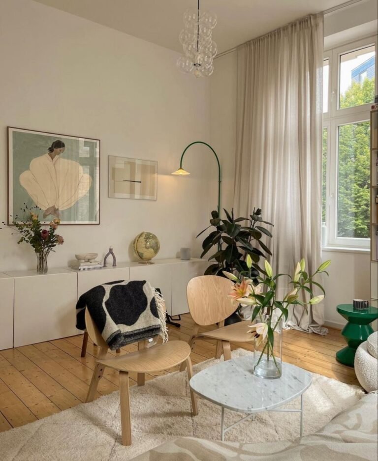
10. Ivory + Dove Gray
Light. Airy. Dove gray and ivory feel like resting in a cloud. Bedrooms in this palette become places where sleep comes easy and mornings feel gentle.
11. Ivory + Lavender
A surprise that never fails to delight. Lavender adds just enough unexpected color to make ivory feel playful. Guest rooms and powder rooms adore this pairing.
12. Ivory + Cream
Nearly the same shade. Nearly.
And that “nearly” is where the elegance hides. The hairline gap between cream and ivory produces tonal luxury — but only when layered with varied textures. Linen. Silk. Wool. Knit. All of it.
Organic and Earthy Combinations
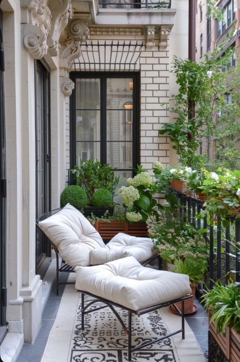
13. Ivory + Sage Green
Spa-like calm in two colors. Sage and ivory together make you exhale the moment you step in. Bathrooms and bedrooms are transformed by this palette.
14. Ivory + Olive Green
Sun-drenched. Mediterranean. Olive green against ivory feels like a countryside escape. Add natural wood and woven fibers to complete the atmosphere.
15. Ivory + Walnut Wood
A partnership older than modern design itself. Walnut’s rich brown tones against ivory walls never, ever fail. Timeless isn’t a buzzword here — it’s a fact.
16. Ivory + Mushroom
That indescribable gray-brown warmth that cocoons you. With ivory, mushroom creates rooms you want to disappear into. In the best possible way.
17. Ivory + Sand
Two whisper-close tones. Beautiful in their sameness — but demanding of texture. Jute, linen, cotton, wool — layer them generously or the room vanishes.
18. Ivory + Moss Green
Deep. Atmospheric. Contemplative. Moss green in an ivory-walled reading nook creates a private universe. One you won’t want to leave.
Polished and Cool Combinations
19. Ivory + Charcoal
Charcoal brings weight and modernity. It tells ivory, “I’ve got your back.” A charcoal rug under ivory seating? That’s a room with serious visual authority.
20. Ivory + Slate Blue
Hushed luxury. Slate blue and ivory create a sophisticated stillness perfect for bedrooms and lounges. The kind of room where you speak a little softer.
21. Ivory + Cool Gray
Sleek. Current. Cool gray and ivory together read as effortlessly modern. Avoid overly blue grays — a hint of warmth keeps things comfortable.
22. Ivory + Dusty Blue
Soft and romantic. Dusty blue against ivory feels like ocean air on a lazy afternoon. Gentle. Calming. Absolutely beautiful in bedrooms.
23. Ivory + Steel Blue
More assertive than dusty blue. Steel blue and ivory together create an environment of focus and clarity. Home offices thrive in this palette.
24. Ivory + Pewter
Pewter’s metallic whisper changes with the light — bright one moment, muted the next. Against ivory, it adds an ever-shifting glow. Use in fixtures and small metallic details.
Dramatic and Bold Combinations
25. Ivory + Emerald Green
Showtime. Emerald green against ivory is theatrical, luxurious, and completely captivating. One emerald piece — a sofa, a chair, a set of drapes — commands the entire room.
26. Ivory + Black
Not as bold as you think. Ivory softens every edge. Black accents — frames, iron lighting, hardware — look crisp and elegant against ivory’s warmth.
27. Ivory + Navy
A timeless partnership. Navy provides structure and weight. Ivory provides glow and warmth. Together they create rooms with enduring character.
28. Ivory + Burgundy
Old-world luxury made approachable. Burgundy velvet in an ivory room feels grand without pretense. Rich without heaviness.
29. Ivory + Plum
A daring accent that pays off beautifully when used sparingly. Two plum pillows. One art piece. Against ivory, that’s all you need for quiet drama.
30. Ivory + Rust
Autumn’s warmth bottled into a color. Rust and ivory together are cozy, sophisticated, and work every month of the year. Add brass for the finishing touch.
The Texture Mistake That Undoes Beautiful Palettes
You could select the best combination on this list.
And still produce a room that looks lifeless.
The culprit? Identical textures on every surface.
Same cotton. Same matte paint. Same flat weave.
That strips dimension from your room faster than any wrong color.
For every ivory element, introduce at least two different textures.
Smooth ivory walls need linen curtains and a chunky knit throw. A sleek ivory table needs a woven runner beneath it.
Texture gives light somewhere to go. It creates depth, shadow, and movement that flat surfaces simply can’t.
This is what separates professionally styled rooms from well-meaning attempts.
The 60-30-10 Rule: Your Design Safety Net
Every combination above works better with this formula.
- 60% ivory — your dominant surface color.
- 30% companion shade — secondary furniture, curtains, rugs.
- 10% finishing accent — metallics, decorative objects, art.
Feels overwhelming? It’s not. Just eyeball it.
If your room feels chaotic, reduce the 30%.
If it feels bare, increase it.
This rule keeps your palette in proportion. Balanced. Harmonious. Every time.
Time to Transform Your Space
Thirty specific pairings.
A texture rule.
A failsafe formula.
You’re better equipped right now than most people who hire decorators.
So choose. One pairing. The one that felt right in your gut when you read it.
Then go to the room that’s been bugging you. The one you walk through without stopping because nothing pulls you in.
Make one change. Start small. One set of cushions. One new curtain. One freshly painted wall.
Because stunning rooms don’t come from big budgets.
They come from two colors that belong together.
You’ve found yours. Go make it real.