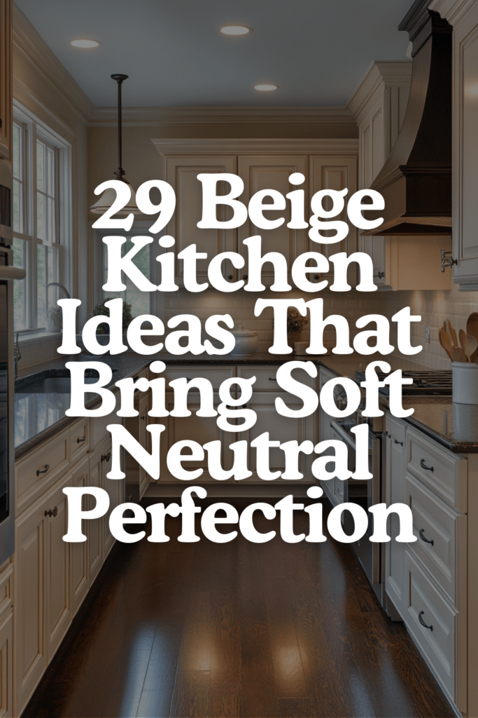
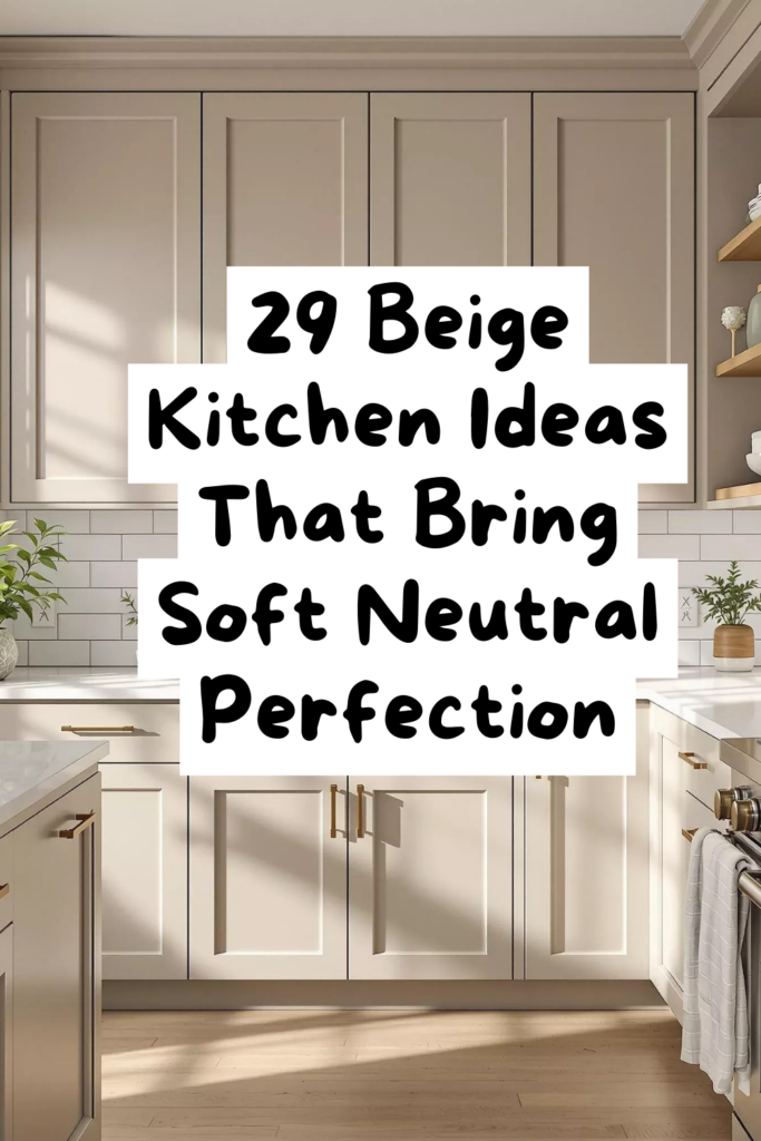
Effortlessly Warm — 29 Beige Kitchen Tricks for a Space You’ll Never Want to Leave
Disclosure : This post may contain affiliate links or paid partnerships. I may earn compensation if you click a link or make a purchase, at no additional cost to you. See my disclosure for more info.
Let’s be brutally honest.
You’ve been stuck.
Not the kind of stuck where you don’t know what you want — you know exactly what you want. You’ve pinned it. Saved it. Screenshotted it from six different angles.
Beige cabinets rising to the ceiling. Stone countertops in warm sand. A plaster-covered range hood catching the last golden light of the day.
You can close your eyes and walk through that kitchen in your mind.
The problem isn’t vision. The problem is execution. You don’t know which decisions to make first, which ones matter most, and which ones you’ll regret.
So you stay stuck. Pinning more. Dreaming more. Doing nothing.
Here’s what I want to offer you: a way out.
Twenty-nine specific design moves that transform beige from “safe and boring” into “warm, sleek, and impossible to forget.” Each one is concrete. Each one works. And together, they build a kitchen that feels exactly like the ones you can’t stop saving.
We’re starting with the biggest visual element in the room.
The Framework That Controls Everything: Cabinet Strategy
Your cabinets claim more visual space than any other element in the kitchen. They’re the skeleton of the design. Everything else hangs on them.
1. Anchor on shaker-style door profiles.
Shaker doors are the evergreen choice. Clean enough to feel contemporary, detailed enough to feel intentional, and proven over generations to never date themselves.
Flat slabs risk feeling cold. Ornate panels risk feeling fussy. Shaker threads the needle every time.
2. Stretch uppers to the ceiling — no gap allowed.
That dead strip between cabinets and ceiling? It’s visual clutter masquerading as empty space.
Ceiling-height cabinets create a clean vertical line from countertop to ceiling. The kitchen instantly feels taller, sharper, and more deliberately designed. Non-negotiable.
3. Deploy two tones — airy uppers, grounded lowers.
Pale cream or off-white on top opens the room up. A richer, sandier beige on the bottom provides weight and stability.
Critical: both shades must carry the same undertone. Yellow-beige above and pink-beige below creates a visual argument that nobody wins.
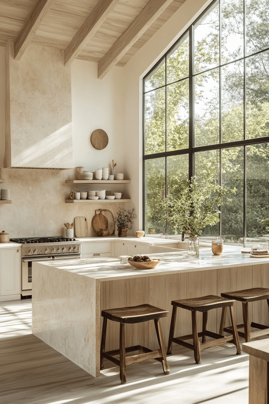
4. Transform the island face with vertical fluting.
A smooth island front is a wasted surface. Fluted or reeded panels introduce architectural dimension, shadow lines, and crafted interest that make the island the star of the kitchen.
5. Go handleless on uppers, hardware on lowers.
The absence of hardware on upper cabinets lets the eye rise freely. The kitchen feels cleaner and taller.
Hardware at hand level on lowers provides both grip and a moment of textural contrast. Strategic minimalism in action.
After Dark Matters: Lighting That Makes Beige Radiate
Your cabinet framework is set. Now illuminate it properly — because beige under wrong lighting is beige that fails.
6. Warm up every bulb — 2700K to 3000K across the board.
Cool bulbs are the silent destroyer of beige kitchens. They turn warm tones into flat, gray, vaguely unsettling surfaces.
Warm bulbs make beige luminous. Like sunlight filtering through linen curtains. Audit every bulb in the kitchen. Swap the cold ones. Feel the difference immediately.
7. Install LED strips under your upper cabinets.
Soft light cascading downward onto your countertops and backsplash creates layered ambiance. No harsh shadows. Just a warm, even glow that makes materials come alive.
In the evening, this becomes your kitchen’s primary light source — and it’s absolutely beautiful.
8. Give yourself control with a dimmer switch.
Bright for prep work. Dim for conversation.
Beige is uniquely sensitive to light intensity. A dimmer gives you moment-by-moment control over the room’s warmth and mood. In a beige kitchen, it’s not a convenience — it’s a design tool.
Where Beige Gets Interesting: Texture Moves That Add Depth and Soul
Lighting and cabinets give your kitchen its framework and glow. Texture gives it something to feel.
An all-beige kitchen without texture variation is like a painting with only one shade. It’s technically fine but emotionally flat.
9. Go zellige on the backsplash.
Each handmade tile is a tiny individual — different in shade, surface texture, and light reflection.
In cream or sand tones, a zellige backsplash has living depth. It changes with the light. It draws people closer. It’s the kind of surface that starts conversations.
10. Coat your range hood in hand-applied plaster.
Limewash. Venetian plaster. Roman clay.
Whichever you choose, the textured finish transforms a kitchen appliance into sculptural art. As daylight shifts, the surface reveals new facets — new warmth, new shadow, new character.
11. Float warm-toned wood shelves for organic contrast.
Honey oak. White oak. Light walnut.
Two open shelves in natural wood break the smooth uniformity of an all-beige scheme. Stack your most-loved everyday pieces. Let it feel lived-in.
12. Roll out a natural fiber runner along the work zone.
Jute. Sisal. Textured wool.
A woven runner underfoot softens the space physically and visually. It adds warmth where your bare feet land first. It says: this kitchen was made for humans.
13. Hang a woven pendant above the island.
Rattan, wicker, or cane.
One organic light fixture throws soft shadow patterns across beige surfaces, creating visual movement and warmth that smooth finishes alone can never generate.
Building on Bedrock: Getting Your Beige Base Absolutely Right
With your design vision sharpening, let’s lock down the foundational decisions that everything else relies on.
14. Pinpoint your undertone before committing to anything.
Beige hides its true nature in undertones — pink, yellow, green, gray. Each shifts the kitchen’s emotional temperature dramatically.
White paper. Swatch. Compare. The undertone will emerge. Choose it deliberately. Then narrow to a specific shade.
15. Match beige warmth to your kitchen’s natural light.
North-facing kitchen? Cool light all day. Lean your beige warm — honey, gold, wheat.
South-facing? The sun does the warming. You can safely choose a cooler, grayer beige and it’ll still feel inviting.
Ignoring this is how a perfect swatch turns into a regrettable kitchen.
16. Test paint samples through three different lighting periods.
Morning. Midday. Evening.
Same wall. Three shockingly different appearances. Never decide from a single swatch under a single light. Give yourself 48 hours. That waiting period is your cheapest insurance policy.
17. Assign matte to walls, satin to cabinet surfaces.
Matte gives walls soft, light-absorbing depth. Gorgeous on broad surfaces.
On cabinets that get daily fingerprints? Satin is the answer. Subtle sheen. Easy cleanup. Elegant without going glossy.
What Gives the Room Its Heartbeat: Finishing Touches That Make It Personal
The bones and atmosphere are built. Now add the elements that turn a well-designed space into a space that feels like yours.
18. Arrange handmade ceramics on open shelving.
Not matching sets from a chain store. Handcrafted pieces. Slightly imperfect. Rich in character.
Three pieces at different heights. A textured bowl. A clay vessel. These objects inject warmth that manufactured items can’t replicate.
19. Let greenery breathe in the room.
A potted olive tree. Herbs in terracotta. A branch of eucalyptus in a stoneware vase.
Green layered against beige creates a natural harmony that feels effortless. It doesn’t compete. It completes.
20. Blend your sink into the countertop.
White porcelain is too stark. Stainless steel is too cold.
A composite sink in sand, biscuit, or warm stone dissolves into the countertop surface. The visual flow stays uninterrupted.
21. Display things in odd numbers.
Three. Five. One.
Odd groupings satisfy the eye in a way even numbers simply don’t. A foundational design rule that’s free to implement.
22. Decode the pattern in your saved inspiration.
Pull up your boards. Study the kitchens that grabbed you.
They share common DNA — undertones, textures, a feeling of restrained beauty. When you identify that code, you move from passive inspiration to active design.
The Precision Details: Hardware and Fixtures That Complete the Picture
Almost there. These final detail choices carry disproportionate visual impact.
23. Choose unlacquered brass or champagne gold.
Chrome runs cold. Matte black can feel heavy.
Unlacquered brass earns character through a developing patina. Champagne gold stays clean and warm. Both are natural allies for beige.
24. Match every visible metal finish.
Unless you’re experienced at metal mixing, keep it unified. Same finish on handles, knobs, and faucet.
Consistency creates calm. Calm creates the feeling of luxury.
25. Replace outlet covers with wall-matching versions.
White plastic on warm beige walls is visual interference — small but persistent.
Matching covers take a minute to install and cost almost nothing. The result: walls that finally feel seamless and finished.
The Workhorse Zone: Countertop and Surface Decisions
Last section. The surfaces where hands land, meals form, and life unfolds.
26. Pick countertop stone with subtle, gentle veining.
Dramatic patterns compete with beige’s quietness. You want surfaces that harmonize.
Quartz or natural stone with soft movement in cream, taupe, or warm gray. Let the countertop support the story instead of hijacking it.
27. Go thick on the edge — minimum two inches.
Thin edges look budget no matter what material they’re cut from.
A thick, weighty edge adds instant sophistication. It tells anyone looking that this surface was chosen with care.
28. Pour the countertop down the island with a waterfall edge.
Material flowing top to floor without interruption creates a monolithic effect. In beige tones, it reads like sculpted sandstone — dramatic yet serene.
29. Link backsplash to countertop, not cabinetry.
This creates visual unity. Backsplash and countertop reading as one continuous surface makes the kitchen feel larger, smoother, and more deliberately designed.
One shift in thinking. Massive shift in outcome.
Your Next Step Isn’t a Pin — It’s a Decision
You’ve pinned enough beautiful kitchens to wallpaper a mansion.
Now it’s time to build one.
Not with an unlimited budget. Not with a design degree. With 29 intentional decisions rooted in how light, texture, color, and proportion actually work.
Beige is the warmest, most elegant foundation you’ll find. But it only delivers its full power when you treat it with intention. When you respect the undertones, layer the textures, dial the lighting, and choose every detail on purpose.
Take this list. Start wherever makes sense for you. One trick at a time.
And build the kitchen that doesn’t just stop scrollers in their tracks — but stops you in your own doorway. Coffee in hand. Morning sun pooling across warm stone.
No desire to leave.
That’s the kitchen you deserve. Now go build it.